André Vale Football Legacy
A legacy that starts small, grows with consistency and leaves a lasting mark.
About the brand
André Vale Football Legacy is the personal brand of André Vale, a football coach and mentor with more than 12 years of experience at SL Benfica, one of Europe's most prestigious clubs. The brand expresses a rare combination: elite technical knowledge joined with a genuinely human purpose.
It speaks mainly to the North American soccer ecosystem (coaches, sporting directors, club owners and ambitious athletes) who want to bring proven European standards and methodology to their game. Since the audience is in the United States, the entire identity and communication were built in English.
The creative process
The challenge was to build an authentic personal brand, looking not at competitors but at the essence and purpose of football, translating into design the balance between technical strength and human sensitivity. It needed to be minimalist, professional and emotionally engaging.
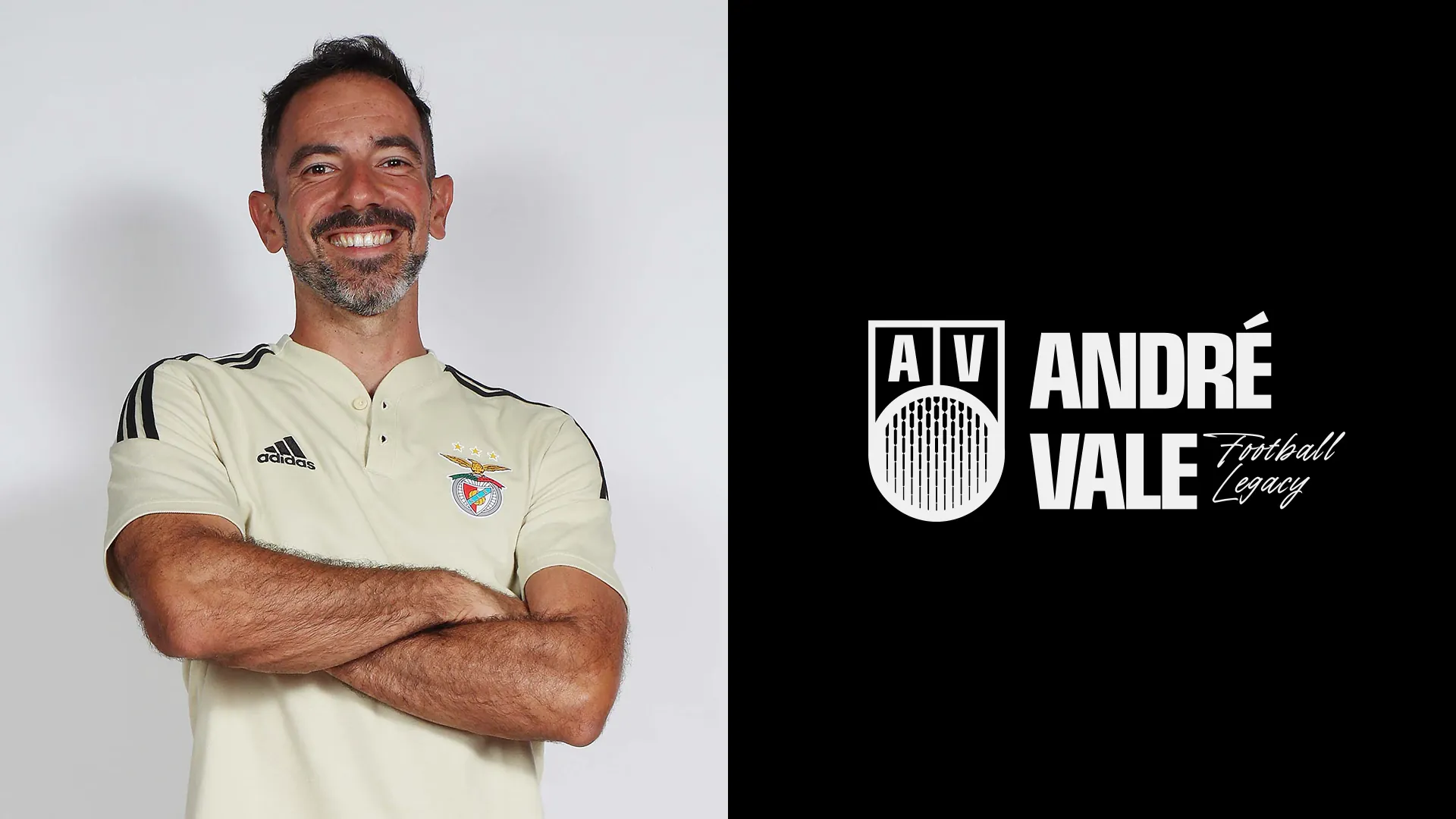
We anchored the brand in two archetypes that define André himself: the Sage, who shares deep knowledge, and the Caregiver, who guides and transforms through empathy. From there came a central concept uniting three pillars: Legacy, Minimalism and the Energy of Sport. The idea of legacy, something that starts small but grows with consistency and leaves a lasting mark, became the thread running through the entire visual system.
“Legacy. Minimalism. Energy of Sport.”
The symbol and the logo
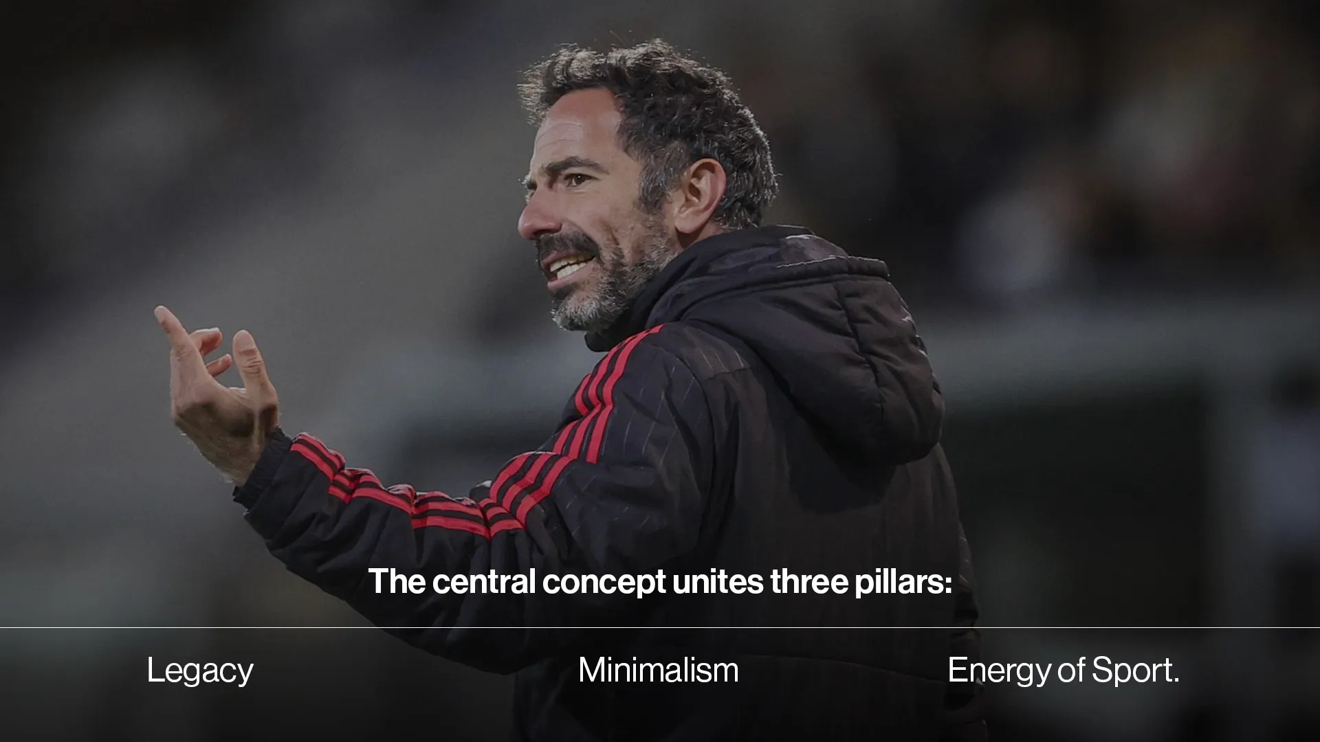
The symbol is built from figures that repeat and grow progressively, expressing the growing, multiplying impact of André's work. These figures are wrapped in a circular shape, a reference to the ball, and arranged in a crest with the initials “AV”, a direct nod to the tradition and heritage of European football. The crest gives the brand an iconic, timeless and winning character.
The logo comes in two horizontal versions, one with continuous text and one with a visual break, both in black and white, ensuring versatility and coherence with the brand's minimalist style.
The visual system
Every element reinforces the balance between technical precision and contemporary energy.
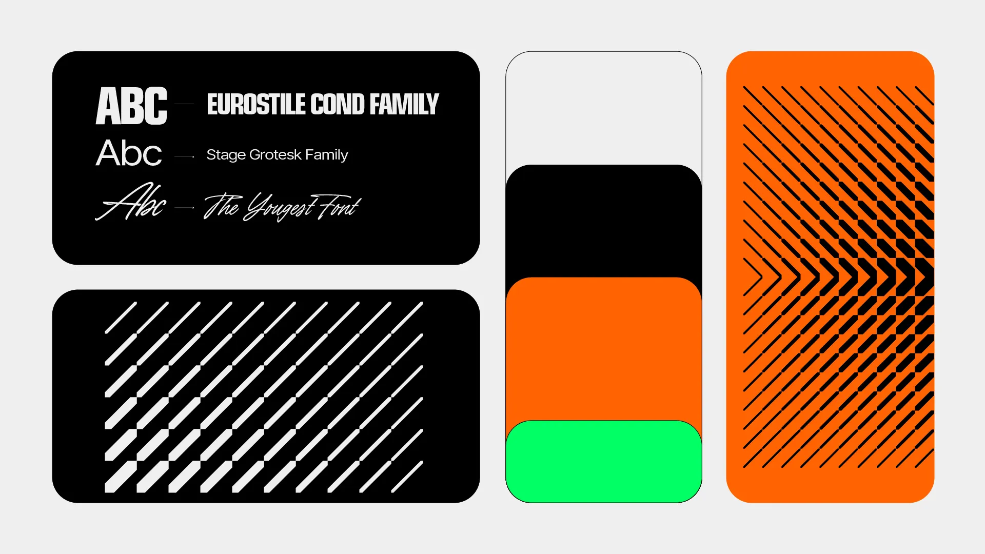
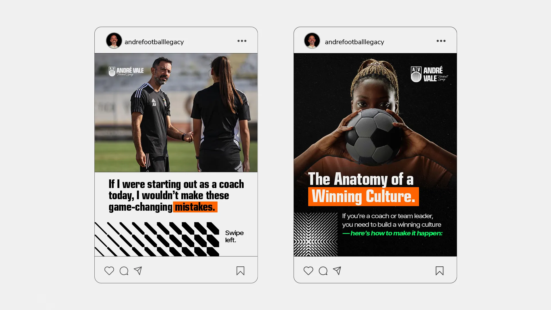
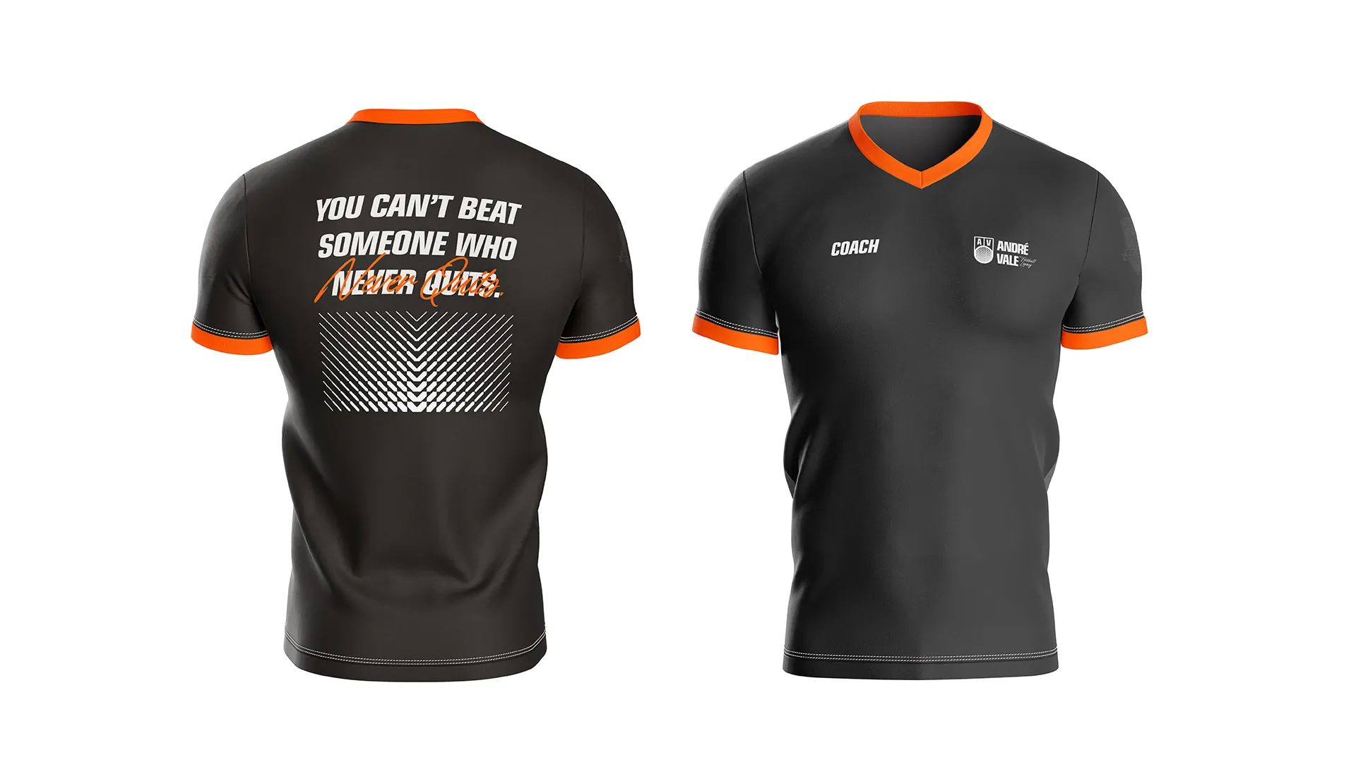
Off-white and black convey professionalism, sobriety and trust; orange brings the energy, passion and vitality of sport; and a neon green accent signals innovation and a visionary outlook, perfect for someone bridging European football and the new American horizon.
A dual system: a solid, commanding typeface for headlines and keywords, reinforcing the presence of an experienced mentor; a clean, highly legible typeface for longer texts, ensuring accessible, human communication; and an expressive display style for highlights, adding contemporary energy.
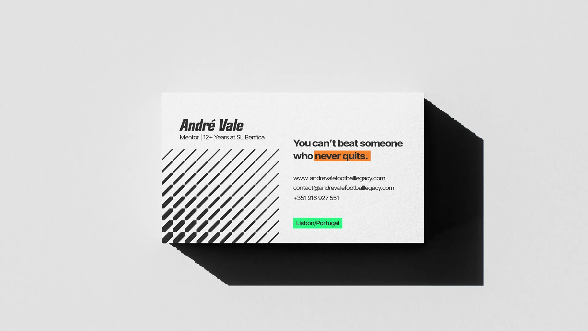
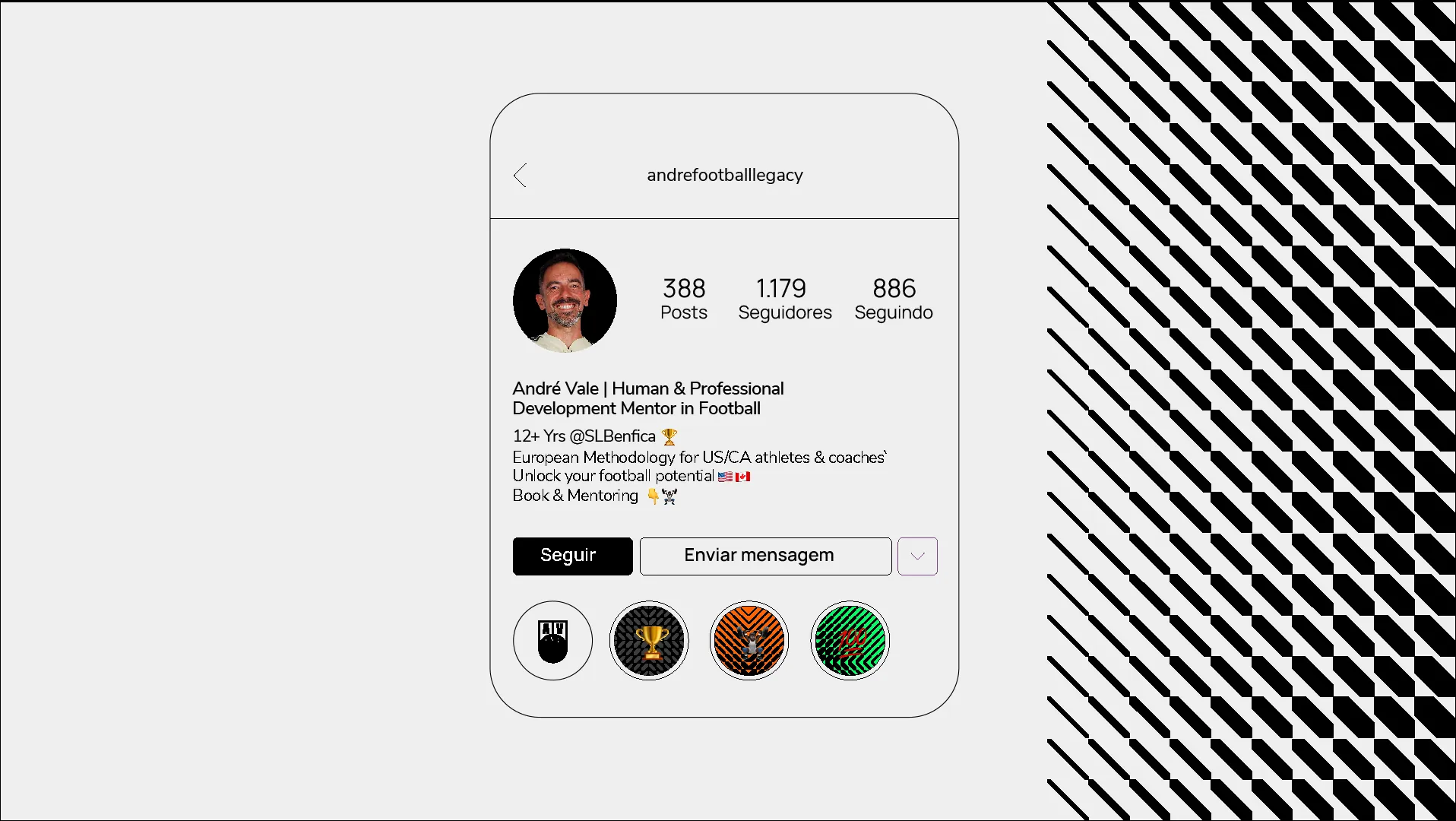
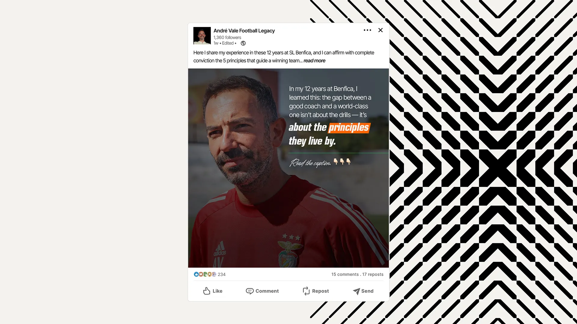
Built from the repetition of the brand's central “legacy” element, the pattern represents the continuous, multiplying impact of André's work: a legacy that spreads, inspires and endures. It works as a distinctive, emotional graphic signature across every application.
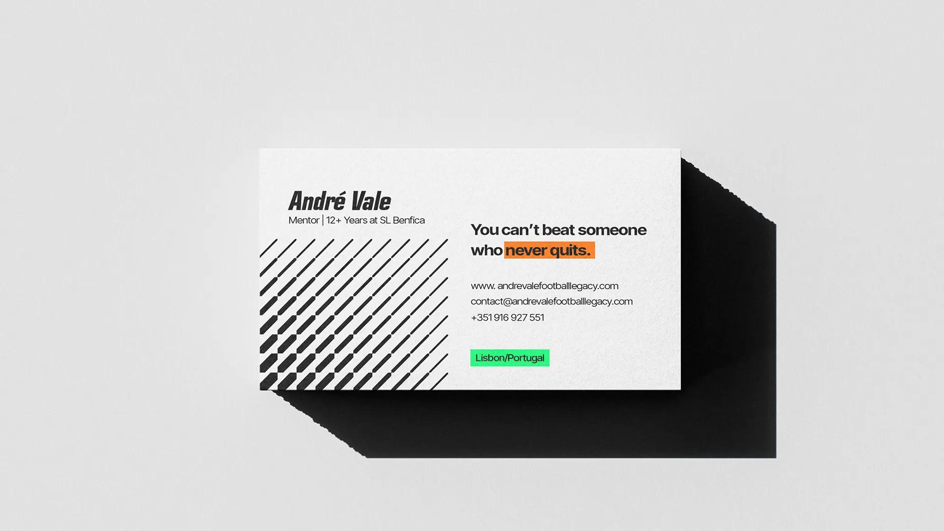
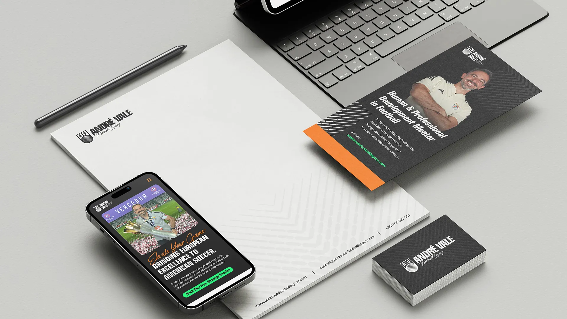
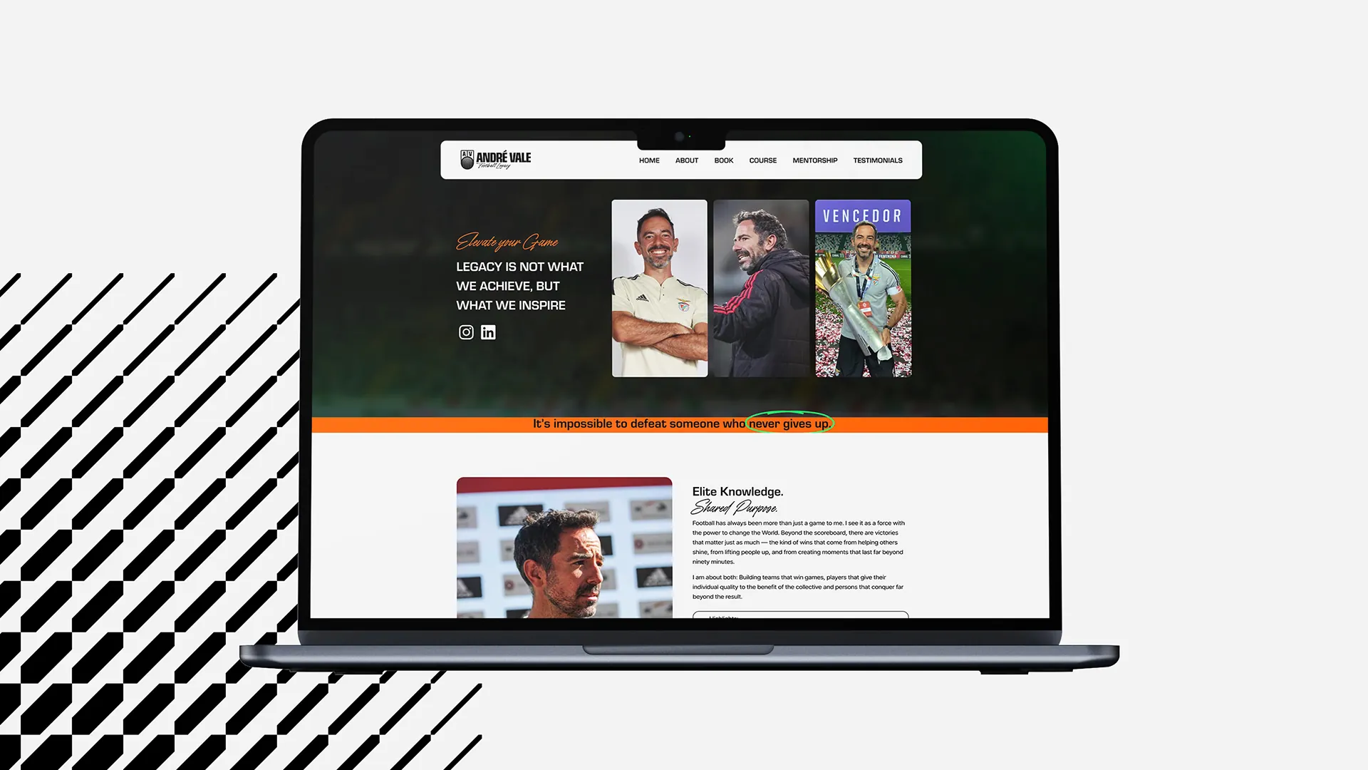
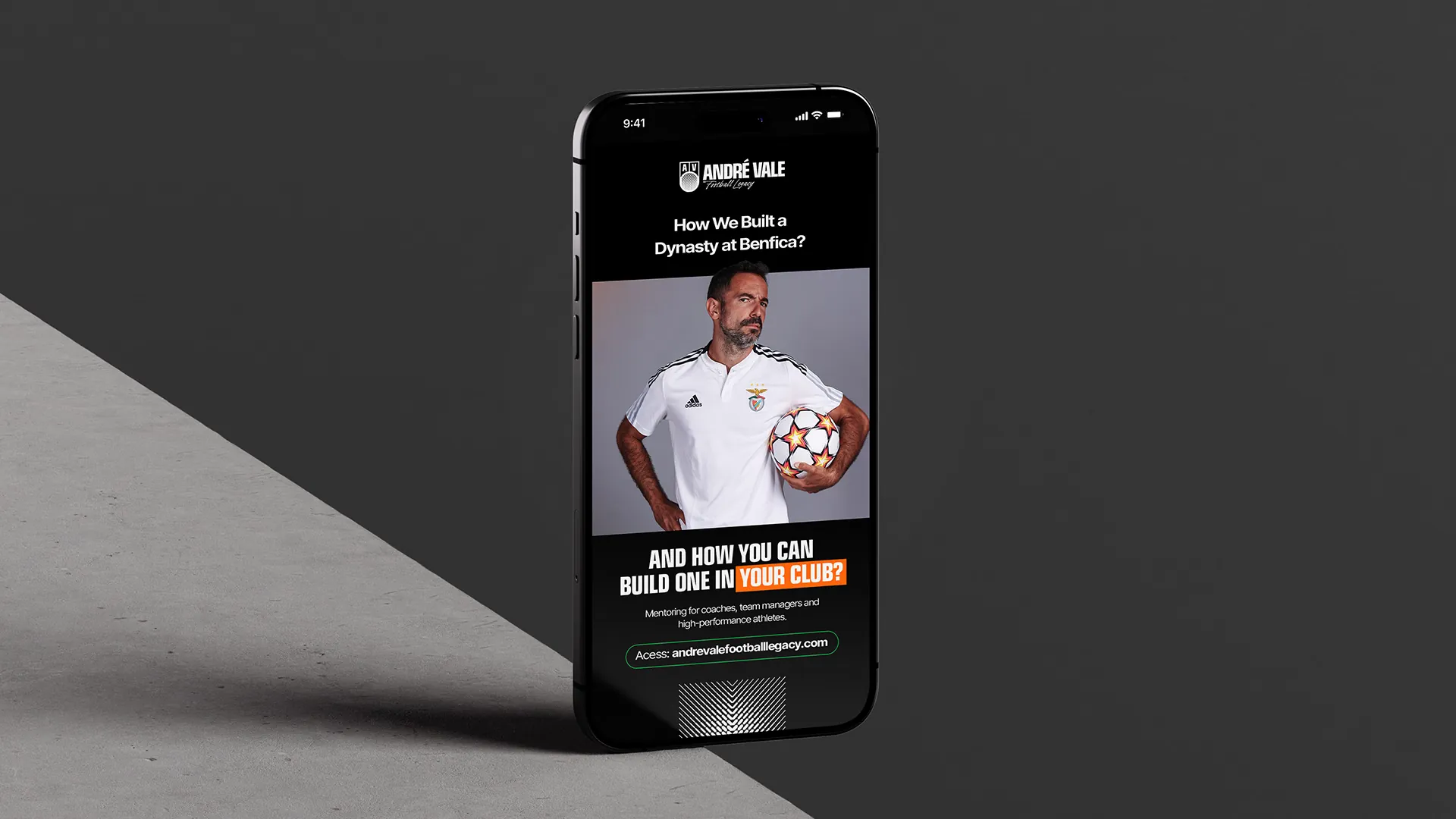
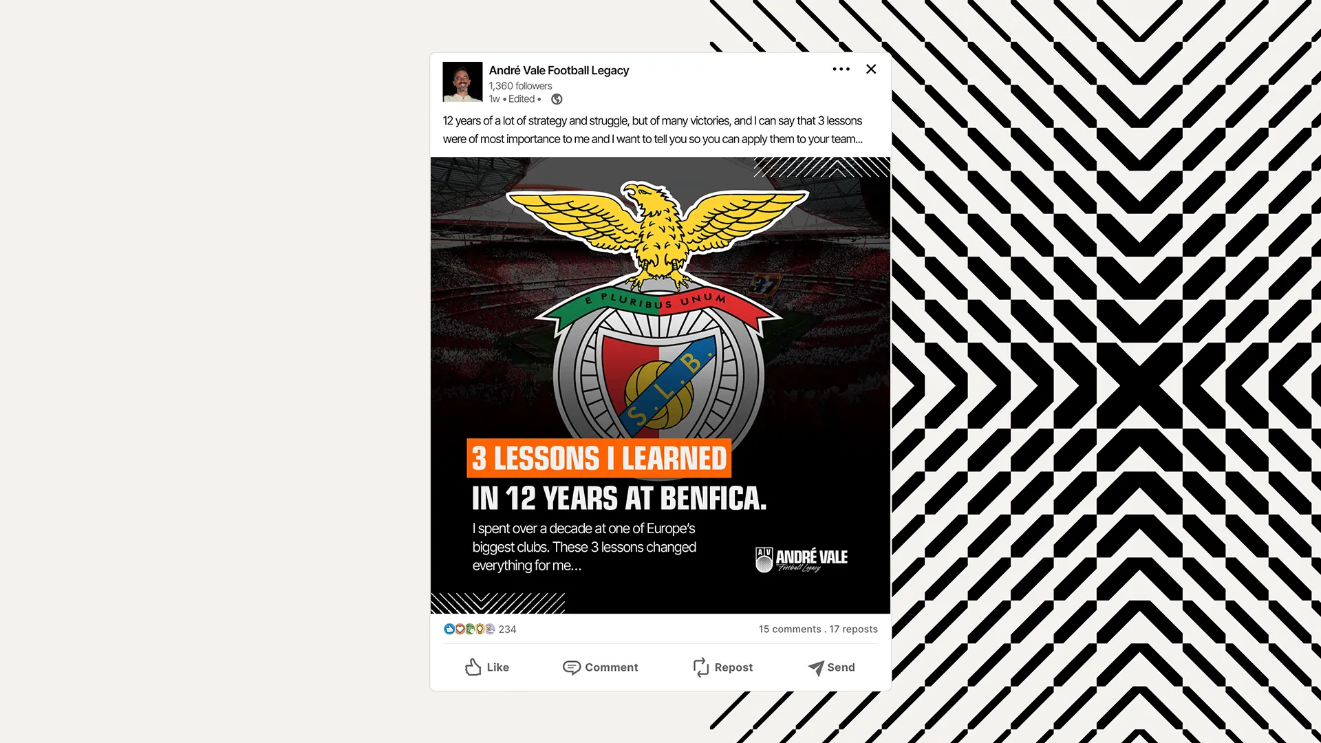
The brand in use.
10 applications
What if your brand had a creative arm like this one?
If you've made it this far, we might be a good fit.